Blog #5


I chose a website design called Every Last Drop as my favorite single page website. This website contains few sentence, with animation creating fully interactive and auto-scrolling scripts on the same page. Overall A single page website is a great way for visitors to save time because they don’t have to jump form one page to another. Especially this single website page takes longer to achieve its objectives but this type of website can indeed be useful. Every Last Drop is more interesting because it changes the environment around the characters when user scrolls down. Explore user Said “Single page websites became a trend recently mostly among designer sites because this year of web design is perfect for a portfolio”

Screen Shot 2013-11-20 at 3.20.49 PM Screen Shot 2013-11-20 at 3.20.32 PM Screen Shot 2013-11-20 at 3.21.03 PM


My least favorite single website page is www.colourpixel.com

I think this website page has too much text followed by several paragraphs describing what the site is about. I think it would be better to have a big, bold descriptive headline, as the first thing the user sees.

Screen Shot 2013-11-20 at 3.50.47 PM Screen Shot 2013-11-20 at 3.51.04 PM Screen Shot 2013-11-20 at 3.51.11 PM


The Beatles


Beatles were an English Rock band from Liverpool, England. There were one of the greatest and most influential rock bands and innovators of popular music. This website consists of 8 pages including home, explore, albums, songs, news, store, register, and play music. It also has 12columns, a layout with pictures to explore, lyrics to their songs, photos and much more information about the Beatles.

The Navigation bar has a consistent feel and appearance, and a user can navigate it easily. It also has a hierarchy between letters by using small and large font size. So much has been said and written about the Beatles, but they have an incredible amount of interesting infScreen Shot 2013-11-20 at 3.51.29 PM Screen Shot 2013-11-20 at 3.51.59 PM Screen Shot 2013-11-20 at 3.51.40 PMormation on this website.

Nov.7 Nick Finck

Screen Shot 2013-11-13 at 3.07.02 AM

On November 7th, 2013,  I went to hear Nick Finck speak about the Nuances of UX. Nick is a User Experience professional who has worked in the web industry for a long time and specializes in information architecture, interaction design, usability and user research for the web as well as mobile application. Also, he created web and mobile experience for 500 different companies such as Adobe, google, and oprah.com.  In his speech, he discussed the details in apps and websites that we use everyday in life but don’t notice what we are using.

Design&Detail – During his speech, he gave quote from Diter Rams who said “Good design is consistent in every detail — Nothing must be arbitrary. Thoroughness and accuracy in the design process shows respect towards the user”. he named such examples as Target and CNN. He also discussed about how the pages open on Ipad or other devices and their position.

Design&Simplification– Diter Rams said, “Good Design is as little design as possible”. Finck stressed that less results in better design because good design concentrates on essential aspects. It also has purity and simplicity. BUT too much simplicity can confuse the audience.

Design&Process– Finck stressed that every new product that comes out, must be better than the other products on the market.

Design&Research-Observation, and Research.Finck developed design method, the key to observing better design. He also stressed that research needs to be based on practice.

Blog post #4

My book is called Memoirs of Geisha by Author Golden, however he does not provide a website, so I chose three different authors for this blog post assignment. They are Dr. Dale Atkins, Emily Arsenault, and Lucienner Diver of the fiction genre.

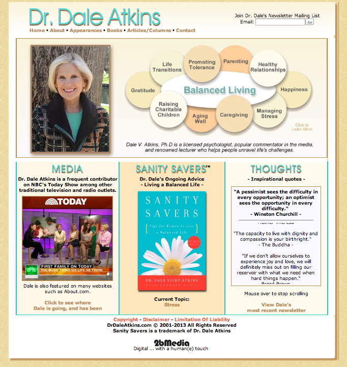
Dr. Dale Atkins‘s website consist three column layout with six of pages. The  Home, About, Appearance, Books, Article/column, and contact. The homepage consist many text, and first my eyes draw attention on her picture and then circular shapes on right side. If I am a designer of this website, i would reduce the number of elements competing to be the number 1 focal points on the page.

Screen Shot 2013-11-04 at 1.36.19 AM

I do not think big letter with shadow does not works well because it feels distracting my eyes, and it lost on the webpage.

Screen Shot 2013-11-04 at 1.40.11 AM

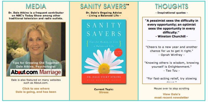
As you can see my screen shots, the home divided into three column. The left side consist of Media, it indicated what she contribute through media such as TV shows, interview and News CNN. Middle section consist her famous book title. The right column consist of Thoughts, you can read and get inspiration. This css style ( moving text top) interesting, i want to know what code for this style.

Screen Shot 2013-11-04 at 1.49.29 AM

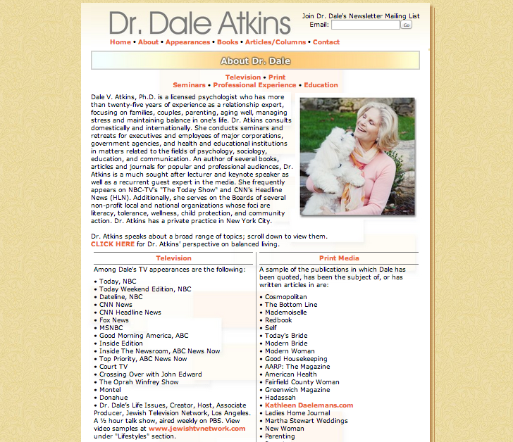
This page is more about biography on Dr. Dale Atkins. It said her life style and how she get become psychologist as well as book writer. It also consist two column with Television and Print media, it show her contribute through her life.

Screen Shot 2013-11-04 at 1.51.21 AM

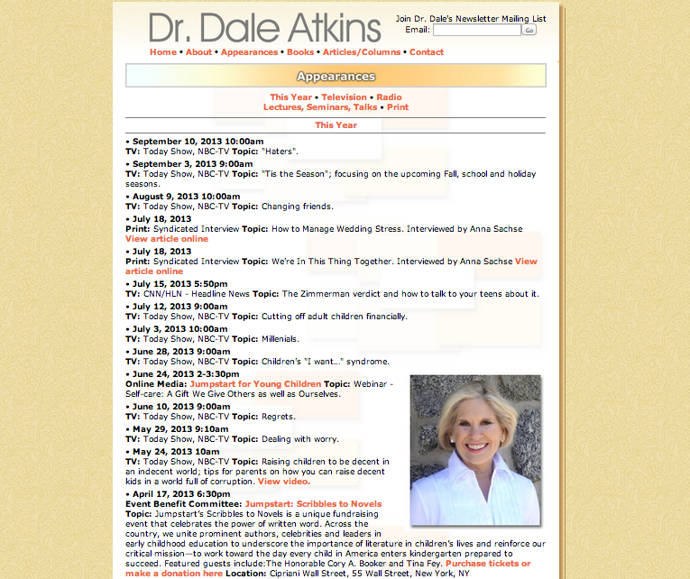
This Appearances page consist of her activity. Last updates are on September10, i can see she is very active women, and How she dedicate her life with many different media sources.

Screen Shot 2013-11-04 at 1.51.47 AM

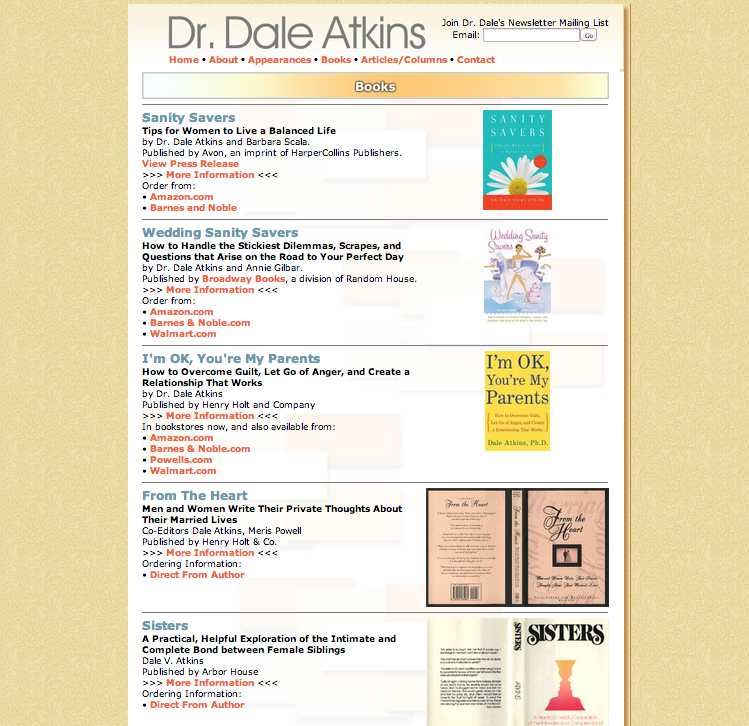
This page are few of Dr. Dale Atkins published books with some few brief description of books. All of her books can order from several site to buy books online. She also made link for more information so that we know what the books about.

Screen Shot 2013-11-04 at 1.52.06 AM

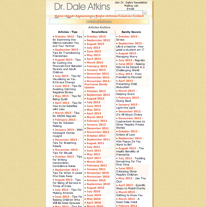
The Article/Columns consist of Three column and it show what she writs about each month.

Screen Shot 2013-11-04 at 1.52.22 AM

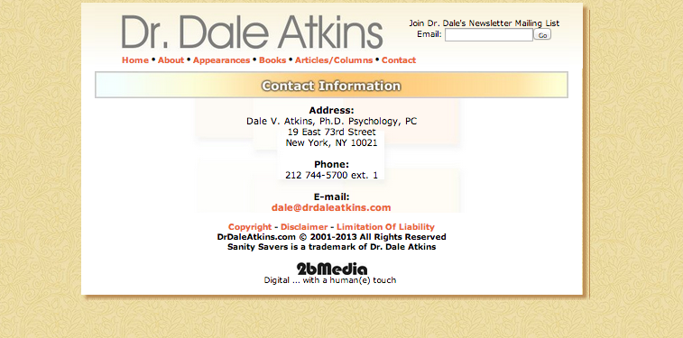
And last, Contact information about Dale Atkins.

Screen Shot 2013-11-04 at 1.52.33 AM

Emily Arsenault

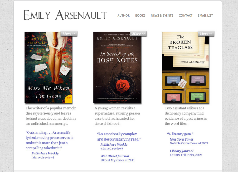
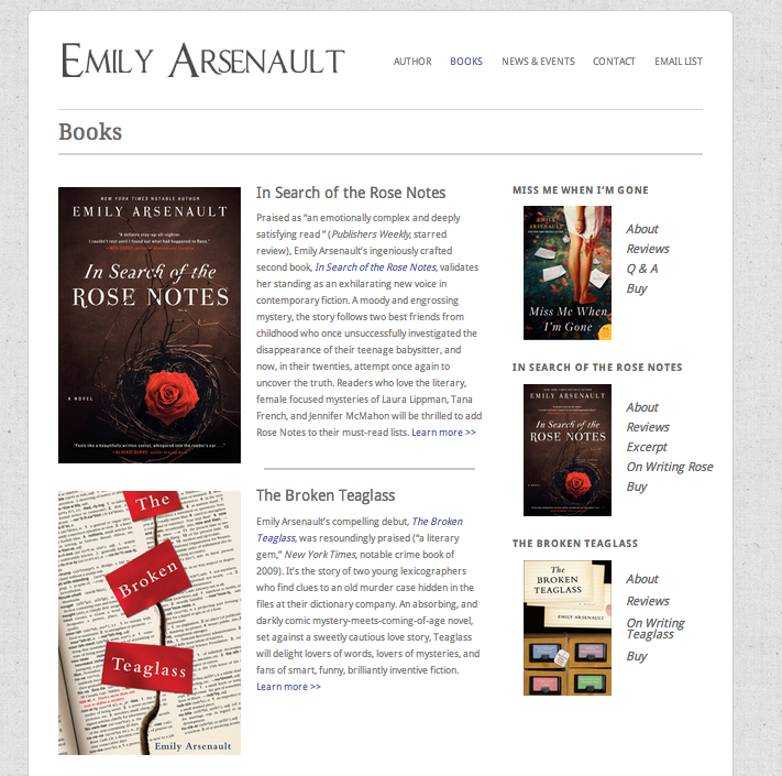
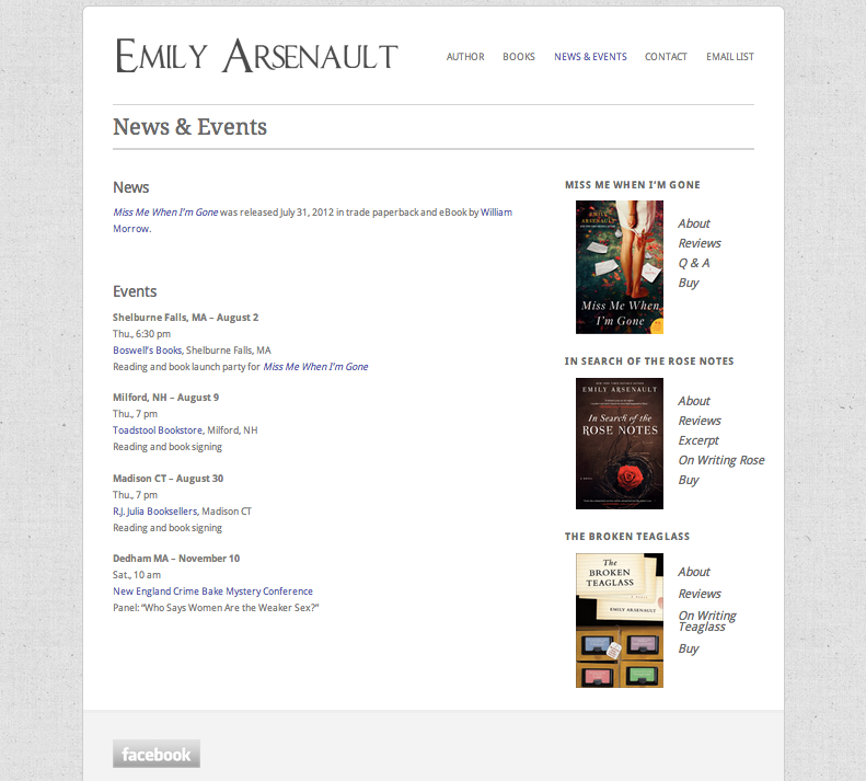
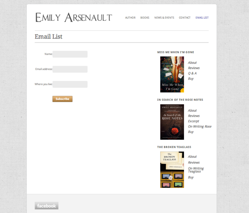
Emily Arsenault’s website has a navigation bar at top right of the page and it contain 5 different pages. The Author, Books, News/Events, Contact and email list. I think this website are more successful than first one because it deliver clear and color of this page are works well on this web page. This website use serif on the author’s name and san-serif on the navigation bar. I feel E and A on Authors  name are unnecessary big, losing base line on the type face and it feel disconnected. The home page listed her main three books, I love the idea of how she emphasize on her books. Also, few description on bottom of her image even helps understanding what books about. You have to click to navigates to next page.

Screen Shot 2013-11-04 at 2.08.50 AM

The Author pages about her life. Instead of using paragraph, it using bullets. It also created nice and clean looks on the page.

Screen Shot 2013-11-04 at 2.09.18 AM

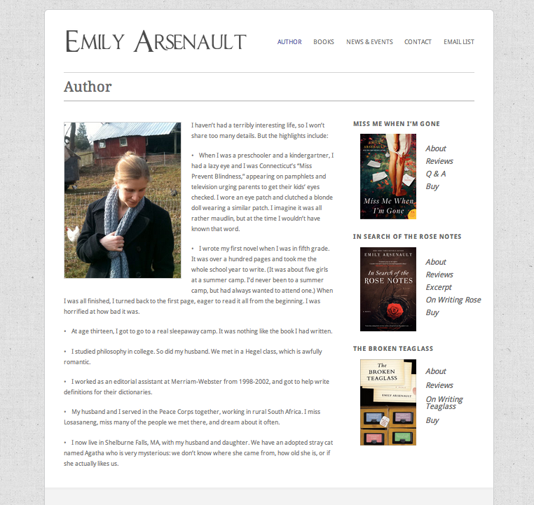
The books page, Emily does not have many books. This probably most important page because it show what she currently publish through her life.

Screen Shot 2013-11-04 at 2.09.32 AM

When i see this website pages, i realized that i think can created this pages very easily. Every elements looks similar what i’ve learned from class. Her names on left side still bothering but other then that, font and size are readable!.

Screen Shot 2013-11-04 at 2.09.43 AM

-Contact page

Screen Shot 2013-11-04 at 2.09.53 AM

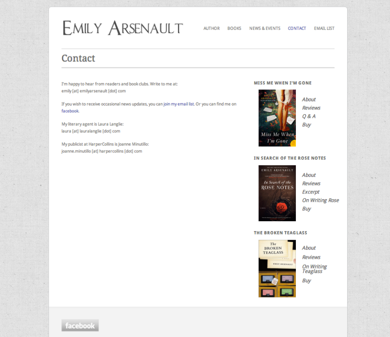
She also include Email list, so she can communicate with reader.
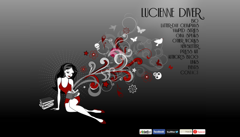
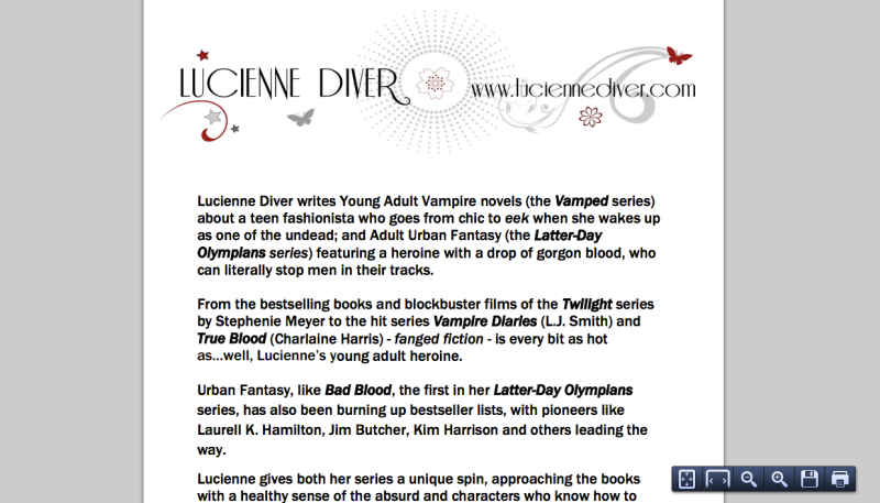
Screen Shot 2013-11-04 at 2.10.07 AM

Lucienne Diver

I think Author Lucienne Diver’s website is most creative. First thing, my eyes goes on images on bottom left side. I think that explain the page instantly, explain this author wrote many fiction/fantasy books. But The navigation bar font color feel loosing with dark gray background.

Screen Shot 2013-11-04 at 10.42.16 AM

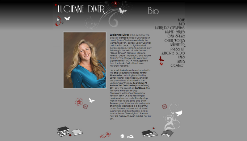
Bio consist of her life story with some bold high lights on the paragraph. I love how she put illustration on her whole page.But i feel like navigation bar font face loosing when i keep staring the type. It works on her name but not quite sure on navigation bar.

Screen Shot 2013-11-04 at 10.42.42 AM

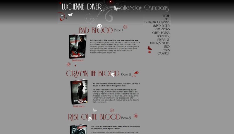
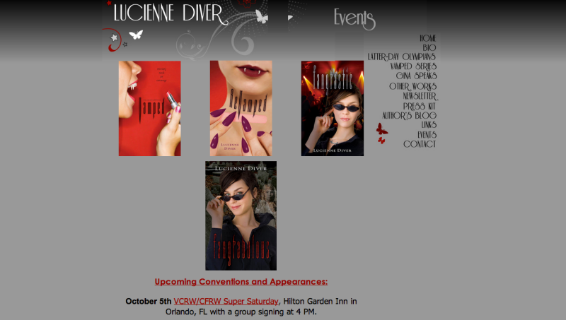
Her books list on this page. Skull on type get lost and distracting on my eyes. I think that is unnecessary illustration.

Screen Shot 2013-11-04 at 10.42.57 AM

She also put pdf file link, so reader can save and print.

Screen Shot 2013-11-04 at 10.43.34 AM

I think this page are most important. As you can see, you can see what events will happen in a future.

Screen Shot 2013-11-04 at 10.44.06 AM

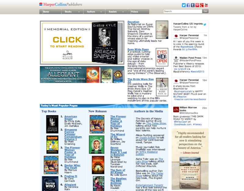
HarperCollins Publishers

I found many different Publisher website but the one that i choose called HarperCollinsPublishers. It also consist of 5 different navigation bar and has many books. This webpage has good contrast among the various section and my eyes naturally goes to the areas that create the most contrast.

Screen Shot 2013-11-04 at 11.05.39 AM

The Home page continuedScreen Shot 2013-11-04 at 11.06.13 AM

Website that My inspiration/Design Decision

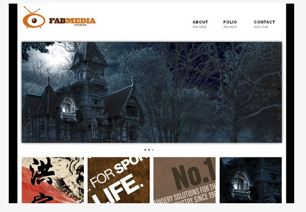
I wanted to use my Design decision as to be clean, nice, and readable. I chose this website as my inspiration because i love how type treated well in this page. Also, navigation bar use two different font-face but it work well each other.

Screen Shot 2013-11-04 at 11.40.37 AM Screen Shot 2013-11-04 at 11.40.47 AM

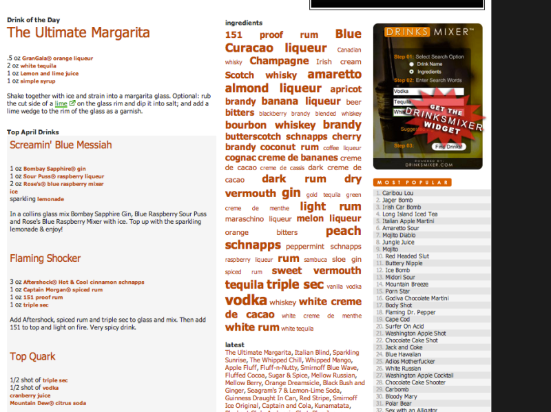
I think type box of ingredients are interesting design decision because It highlight whats most popular ingredients.
Screen Shot 2013-11-04 at 11.41.05 AM

Few more design inspiration for my website..I need to choose what i can really produce on my website. I also wanted emphasize photos on my book website.

Screen Shot 2013-11-04 at 11.55.59 AM Screen Shot 2013-11-04 at 11.55.38 AM Screen Shot 2013-11-04 at 11.55.21 AM

Blog Post #3

Introduction:

For this Blog post assignment, I choose my favorite cloth website to analysis forever21 and express. Both trendy clothing for men and women, but each brand seeking the attention of shoppers in different ways.

Homepage:

Forever 21 choose white background color while Express uses black. Both provides extra emphasis to navigate space for viewer however, white navigates to feel clean and it also creates easier to use colors of entire website. Express use black on background color, this also creates navigates clear but in my opinion with light background color are flooding with viewer’s eyes with a high intensity wall of noise and easy to pick out the low intensity of dark text.

1. Forever 21    2. Express / Front page

Screen Shot 2013-10-28 at 1.11.31 AM Screen Shot 2013-10-28 at 1.11.41 AM

Both navigation bar is located at top of the homepage/bottom of main website title. Forever 21 navigation bar; when you put mouse on top of navigation it drop down menu with sub title which viewer can choose your interest easily and fast. Express navigation bar; However, Express navigation bar display menu does not drop for this website. In my opinion, it took extra move on the website, which is it create unnecessary steps.

Screen Shot 2013-10-28 at 1.23.55 AM

^ Forever 21; Easy and quick navigate bar

Screen Shot 2013-10-28 at 1.24.10 AM ^ Express; Nothing drop down on navigate bar

Both sweater navigates section; few similar and interesting facts on the website.

Forever21; viewer can play with images, For example, when you move your mouse on top of model, it shows different pose while Express just shows one single images. In my opinion, it gives more idea and interesting eye contact to the viewer. But Images on black background ( Express) creates a high contrast situation. I also realize Express love to give extra steps on few links on everything.  Both description were cleared, choose san-serif family to give clear and simplistic. Also, both Forever21 and Express; scale of images has consistency with similar sized and have clear hierarchy with text,image, font-face color.

Screen Shot 2013-10-28 at 2.02.37 AM  <Express         style <Forever 21

Screen Shot 2013-10-28 at 2.04.49 AM^ EXPRESS

Screen Shot 2013-10-28 at 2.05.10 AM^ FOREVER 21 ; Both consistency sized, clear hierarchy, and using san-serif family.

Grid;

Forever 21 and Express targeting and selling same products. The organization of Forever 21 follow with allows the viewer to navigates separation from images and text while Express does not seem to have a grid structure. I actually hard to find grid structure on the webpage, i tried so many times and put different number but could not quite match with grid structure.

EXPRESS-FRONTPAGE  FOREVER21-FRONTPAGE

^ Express                                                                                                   ^ Forever 21

Blog Post #2

PART 1. TYPE AND WEB 

I chose my article called Beautiful TYPE and Web Typography, the main difference between setting types for print and web are the print designs navigate viewer’s eye capture around the information and it selects objects and draws more attention on every single page of elements. But web design navigates based on the users purpose by clicking and scrolling; it has limited movement when you are using web design. Recently, many website use two different typeface, it occur unique feeling.

스크린샷 2013-09-23 11.54.07 AM 스크린샷 2013-09-23 11.54.21 AM

Magazine said “First impressions are lasting impressions. Whether you realize it or not, your typography helps to create an experience for users before they’ve even read a word or clicked a button.”  When you are set up the type for the web, first you have to do is set up the grid. Grids help balance on page and produce for readability and clean on the webpage. And create header and typeface. Type should be readable and easy to understand. I found an article called 10 iconic fonts and why you should never use them; it listed 10 different typefaces that should not be used in our web page. you can also check links at Ironic WEBpage. When we setting type on the page, it should be clarifying and has meaning to it. The benefits by using font at font face and web fonts are it allows a font on a server and delivers through many browsers or web pages.

PART2.

The first website that I have chosen for this assignment isJ.crew. Typography is a very important element of web design, especially shopping places where viewers communicate with web design and not employees in the store. I chose J. Crew’s website because it explains and navigates users from typographic menus, draws attention to menus and images using white space on the web page. They create their web site using a lot of white space, it is keep clean and simple, and highlights important main headlines such as the deal for today so that it makes more contrast inside the white space.

스크린샷 2013-09-23 11.41.40 AM 스크린샷 2013-09-23 11.41.18 AM  스크린샷 2013-09-22 11.53.20 PM 스크린샷 2013-09-22 11.54.09 PM

Too many white spaces can lead boring feelings, however, their layout was pretty overwhelming with the use of typography.Thinner fonts, rounded fonts make it feel chic and modern. This website concentrates more on images then text, but every text deliver is easy to read and communicates with viewers quickly.

스크린샷 2013-09-23 12.24.13 PM

They used typeface called Goudy Old Style fonts, serif, and most readable and legible typefaces over old style classification.

Second website that I chose is called Sagmeister. Stefan Sagmeister is my favorite graphic designer, and he is my inspiration. He is also famous for photo based work and typography, he uses objects such as wire, lights to create typography. His website visually depends on images and his works. I love how they used type one dominant font, to present their table of content. I really liked how they created the search bar, it is simple and clean, and navigates his works of art easily. Not too fancy, not too boring, just keeps it standard design and makes it easy to understand for first time viewers. I think it catches eyes by using same fonts, but different size of text, bold, italic, and highlights.

스크린샷 2013-09-22 11.37.46 PM

스크린샷 2013-09-23 12.44.19 AM 스크린샷 2013-09-23 12.44.58 AM Unknown

Blog Post #1

I choose the website call http://brit.co. This website includes many different sources such as inspirational quotes, trendy cloth, exercise tip, etc. The website focuses on more female perspectives and about 97% of female are utilizing this website. First impression of this website was clean, and loved color palette. I think color works well on this website. The homepage fit the entire screen. This website has balance of icon, rhythm on color, proportional and unity. Not much white space so it draw attention to picture or information on screen. I think design style flow well on this site. It also has search bar on right tap site, so it allows users to navigate easily to your favorite links. A type setting on this page works well because it’s readable, clean and visible. This website also has multimedia web content such as flash, images, sound and video. I think simplicity of displaying the media contents on the website allow the first time users to navigate easily. Recently, this website has been grow quickly because this is where all female share their images based on there common thoughts and interests. I think this website are great place to connect with women around world. This website designed structured grid/layout so that users may gain first impression of the website as well-organized. A benefit of creating grid on the website is that it allows the users to create stronger impression for overall look and feel. If I were website designer on this brit.co I would put more text, eliminate some images on screen because too many images can distract user’s attention.

Image1

iamge1

Image 2

iamge3

Image3

image2

Image4

image4